Sunday, October 16, 2016

Color: morgan smythe

Color

Visible Spectrum: Visible spectrum is the portion of the electromagnetic spectrum that is visible to the human eye. A typical human eye will respond to wavelengths from about 390 to
700mn.


Hues: Hue is the term for the pure spectrum colors commonly referred to by the “color names”
-       Red, orange, blue. The basic hues arte called primary colors.


Primary Colors: The basic hues like orange, red, blue, yellow, and yellow.


Secondary Colors: A color produced by mixing two additive primary colors in equal proportions.


Reflective Colors: Reflected colors are those that result when light is reflected from a pigmented surface that absorbs all wavelengths except those that we see.


Tertiary Hues: The mixture of primary and secondary hues result in tertiary hues.


Complementary Hues: Complementary colors are pairs of colors which, when combined, cancel each other out. This means that when combined, they produce a grey-scale color like white or black. When placed next to each other, they create the strongest contrast for those particular two colors.


Saturation: Saturation is also referred to as “intensity” and “chroma.” It refers to the dominance of hue in the color. On the outer edge of the hue wheel are the 'pure' hues. As you move into the center of the wheel, the hue we are using to describe the color dominates less and less.


Natural Vs. Applied Color: Natural colors are the colors that occur naturally on earth that we depict usually as drown, tan, grey, and white. Applied color is a color that is applied to something with an already natural color. Diametrically opposed to Noguchi's preference for a restrained use of natural colors is the view that color applied to materials intensifies the significance of a work.


Local Color: The color an object appears if seen from nearby under normal lighting. Often these ideas of what color is are used to guide color choices in painting.


Atmospheric Color: A color that is enhanced or changed by outside forces such as smoke, fog, or light.


Interpretive Color: Color choices are guided by the artist's intent rather than by any external reality to often exaggerate an emotion or set a tone.


Emotional Aspects of Color: The way a color makes a person feel. Colors tend to have a psychological effect on people. Like pink makes us feel calm and happy, but black makes us feel sad and depressed.


Warm/ Cool Colors: We tend to relate colors to degrees of heat or cold. In general, reds and yellows are considered to be warm colors, like those of fire; blues and greens are considered to be cold, like icy water.



Wednesday, October 12, 2016

Elements of Art


Define and add 3 images (one from the book)


Line
Edges
Contour
Positive negative
Implied line
Eyelines
Descriptive line
Decorative line
To describe a subjects mass, volume, or a “visual weight”
Hatching and crosshatching
Expressive lines
Gestural
Directional line (perspective lines)

Shape and Form
Shape (two dimensional area)
High relief
Low Relief
Frontal
Full Round
Walk Through
Open Form
Closed Form
Negative Space/Form
Postitive Space/Form
dynamic form
Static form
Overlapping
Shading/Modeling
Hard edge shape
Soft Edge Shape

Space
Found Objects
Figure ground relationship
Figure ground reversal
Placement
Scale Change
Linear Perspective
Vanishing point
One point perspective
Two Point Perspective
Picture Plane
Horizon Line
Two point perspective
Atmospheric perspective
Point of view
Aerial View(birds eye view)

Scale
Spatial illusion

Texture
Actual texture
Simulated texture
Trompe l’oeil

Value and Light
Value scale
Highlights
Local values
Full tonal range
Interpretive values
Chiascuro
High contrast
Lighting
Reflections
Light as a medium

Color
Visible spectrum
Hues
Primary colors
Secondary colors
Reflective (subtractive)colors
Tertiary Hues
Complementary Hues
Saturation
Natural vs applied color
Local color
Atmospheric color
Interpretive color
Emotional aspects of color
Warm/Cool colors
Advancing/receding colors
Color combinations or palettes
monochromatic
Analogous colors
complementary
Split complementary
Triadic color scheme
Interaction of color
Op Art
Page 151
Broken colors
Pointilism
Open Palette
Limited Palette

TIME
Kinetic sculpture
illusion of movement
Captured moment
Change through time


Monday, October 3, 2016

Representational and Non-representational Art

Salvador Dali, The Persistence of Memory, 1931
Non-representational art
Abstract/Non-representational Art N.p. N.d.

Johann Anton Eismann, Ein Meerhafen, 1600s

This figurative/representational work from the 17th century depicts easily recognizable objects—ships, people, and buildings.


Source: Boundless. “Figurative and Abstract Art.”


Fine arts and applied arts

Fine arts : the main purpose of a piece of fine art is to be beautiful (ex : painting, sculpture, poetry, dance…)


Baudelaire once said : "poetry has no other purpose than itself". He only wrote poems for the beauty of poetry

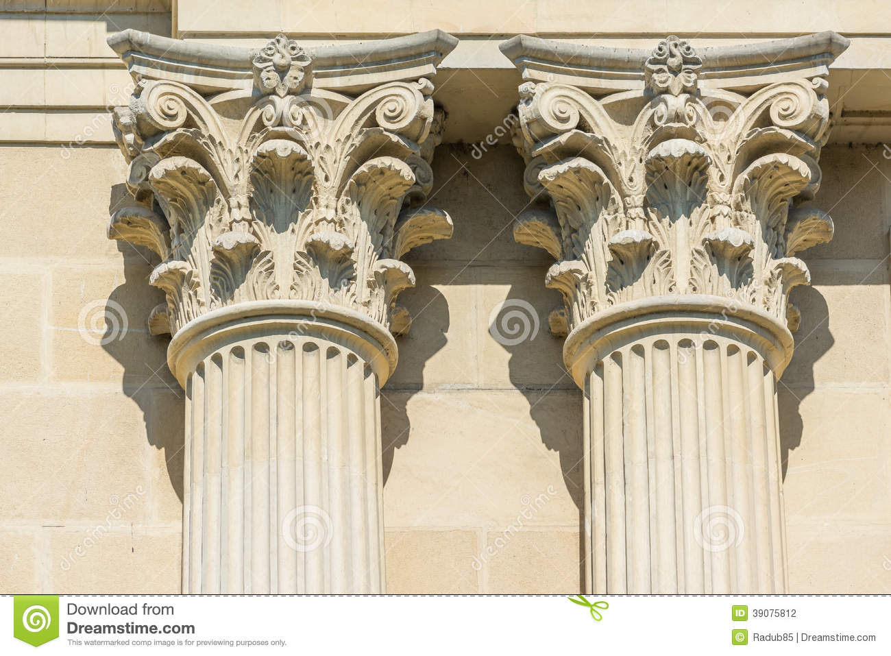
Corinthian style was an architectural style during ancient Greece. the head of the columns were decorated just to add beauty to the buildings.


The starry night


Applied arts : the main purpose of a piece of applied art is to be useful (

Yves Saint Laurent : dress Mondrian. Clothing was first made to cover people's body, and then fashion designers made it beautiful


jewelery

The glassblowing technique

Lasting Greatness


Attributed to Lydos


Persistence of Memory by Salvador Dali


Myron in the Museo Nazionale Romano, Rome